
Friday, 16 December 2011
Sunday, 11 December 2011
3rd Front Page LIIAR Analysis

Institution - METAL HAMMER is published by Future Publishing. The institution is also assumed to be targeting people who prefer alternative/metal music, hence why the front cover features a well known alternative/metal band.
Ideaology - The ideology which we can see behind this front cover is something such as that they want to show that such a high profile band wants to be featured by this magazine, however the band itself has been non-exsistant for a little while due to the loss of the drummer, Jimmy Sullivan (The Rev) which I have mentioned is one of the main themes of this front cover due to the things such as the main singer with his hands in a praying position and the street art of him behind the band, showing us that the band thinks of him as watching over them and possibly making sure that he is not forgotten as such.
Audience - From research into the band I discovered that the age of listener's range from the lower ages of around 13/14 to around the earlier 20's, we can also assume from the different variety of dress which the band has we can assume that the listeners have different varities which might have similarities with the band, for example dark clothes/tattoos/short hair sort of thing.
Representation - The image which is actually on the front cover could be seen as an attempt to make alternative/metal bands look differently in the light of the public, for example at the minute there's different amounts of what people look like and the stereotypes which are associated with the bands type of music. This could be a reason for that to change by showing that alternative/metal bands do have real feeling and the fact that they lost a member and he is the main theme of this cover is fundamental in this change of feeling for the style of the band. The fact that rock/metal music is also stereotyped as music from hell etc. is also the opposite of the main singers posture in the way that he is also praying also shows that they are the opposite of the stereotype or are trying to break the mould.
2nd Front Page LIIAR Analysis

Language - Straight away we see that the band featured on the cover is called Converge, this is due to the large title which is bold and stands out from the other orange and blueish text around it, it's also almost the same size as the magazine name, this shows us that it is of importance, we also label the four people on the front as the band, due to them being stood just behind it. We can also see the sign in the top left which says FREE, this entices the reader to buy the magazine so that they get the free merchandise, in this case the ESCAPI MUSIC DVD, this helps get people who might not like the magazine nor the band to buy it, due to the fact that they could like the offer of the DVD. We also see that their style of the magazine is kept the same throughout, with the engaging colours of blue, white, orange and black, these are standard colours which could've been chosen due to the fact that they're easy to read, what with white and black being complete opposites and blue and orange being used in programs and magazines which people who have colour blindness might read, this could open the magazine to a larger variety of readers, therefore increasing the readership variety.
Institution - We can automatically assume that decibel wants to be the best music magazine for it's genre, this is due to the fact that the magazine is open to a variety of different readers, however in more research we also can find that decibel doesn't have a publishing house, this is different due to the majority of magazines not publishing themselves.
Ideaology - The ideology associated with this cover is that they want to show off the band CONVERGE, possibly for them to expand the music genre they cover to create additional growth in the audience or just for variety, however they also are trying to draw additional readers in with the offer of a free DVD and the other bands which are noticed on the cover, for example KillSwitch Engage (KSE) and The Dillinger Escape Plan. However the magazine itself also has it's own ideology in the form of it's name, we can assume due to it covering metal bands which are generally quite loud it's name shows that it wants to be the loudest and best magazine for metal and loud music out there.
Audience - From the look of the band we can assume that they're around 18-28 this involves the readers age also what with any readers from 18-28 being able to possibly relate themselves with the band, the audience could also look like the band, what with the long hair and tattoos.
Representation - The image on the front cover of the magazine shows off the iconic or blank t-shirts/vests which are associated with metal concerts and the whole metal fanbase, this allows the readership to relate to them, or possibly spot them in similar clothes enforcing the image of recognised metal symbols. The magazine also represents the band as quite rebellious what with the tattoos and the long hair which is noticeable on 3 of the 4 members of the band, this shows the more public stereotype of metal bands, due to the tattoos moreso than the long hair, due to most people who have tattoos being labelled as 'rebels' and not conforming to society's norm.
Thursday, 1 December 2011
1st Front Page LIIAR Analysis

Institution - The actual institution which publishes the magazine is called, IPC Media which also publishes other magazines of the same type alongside magazines of completely different genres.
Idealogy - The magazine cover shows that the genre contains rebellion, this is shown by the direct glare of the model, he also is wearing various animal print items of clothing which are associated with possible anger/ferociousness which is usually a forefront of rock, with the brash attitudes and angry gestures. He is also clad in studded clothing, showing another angle of the rock stereotypical anger.
Audience - The magazine has a distinct readership profile of people who are of the average age of 24, and are pre-dominately male, however it does have quite a large female following and over half of them work full time, the actual audience however would be fans of rock music what with NME being a magazine which only truly features rock artists and/or alternitive music genres. The magazine also has other bands interviewed about other bands which interests a fair few viewers.
Representation - The magazine shows the main model in a heavy leather jacket and animal print, this could show the heaviness of the rock lifestyle along with the wild attitude and backstage shows which are attributed to it.
Target Audience + Price
Through research I have found that the average age of a person who reads a music magazine is around 24 and that 52% of them work fulltime while 27% of them are studying fulltime with only 7% of them working part-time, due to this and combine with my research which places popular music magazines costing from £2.30 to £4.50, with this information I will more than likely make my magazine within the cost bracket of £2.10 - £2.35 this is due to it needing to be cost effective, however the people who I am trying to provide for also cannot afford a large sum for something which would be released every 2-3 weeks.
Monday, 7 November 2011
LIIAR analysis of the Brief.
Language - My music magazine will need to contain a masthead, sub-titles with appropriate content, advertisements which contain suitable offers to my target audience and a colour scheme which will correspond to the genre of music I am trying to portray. I will also use camera angles such as MCU and possibly Midshots to show the type of clothes and style of people I use in my magazine.
Institution - During the production of the magazine it will be printed on A4 paper, non-slip which would allow the reader to not worry about dropping and accidentally ripping said magazine, an example of this type of paper is the music magazine NME, however I would possibly try to use some sort of a glossy paper to enhance the visual look while it was being sold, since it can't really show off itself while it's on a shelf. The actual magazine would probably be sold for around £1.25 to £1.80, however I'm leaning towards a a slightly balanced price such as £1.45 or £1.55.
Ideology - Ideology refers to the values of the company or the morals/ideals that they wish to follow, the company will try to keep to these standards in order to keep readers happy. For example NME mainly uses rock or alternative bands but also likes to use news to it's advantage.
Audience - Audience refers to the people who the magazine is aimed at, this can relate to age, gender, social class or interests etc... 'decibel" for example would be aimed at people who like loud music this could lead on to show that it has an audience of people who enjoy metal/rock music.
Representation - Representation refers to what the music magazine is trying to put across to the audience, this is mainly portrayed on the front cover of a music magazine, if for example, Julian Casablanca was on the front cover of a magazine, we know that the particular issue of the magazine will be aimed at people who enjoy rock music and are interested in him and/or The Strokes, the front cover usually represents what will be on the double page or contents page inside of the magazine.
The Brief - Music Magazine
Main Task - The front page, contents and double page spread of a new music magazine. All images and text used must be original, produced by you - minimum of four images.
Friday, 4 November 2011


Thursday, 3 November 2011
Analysing College Magazine Covers

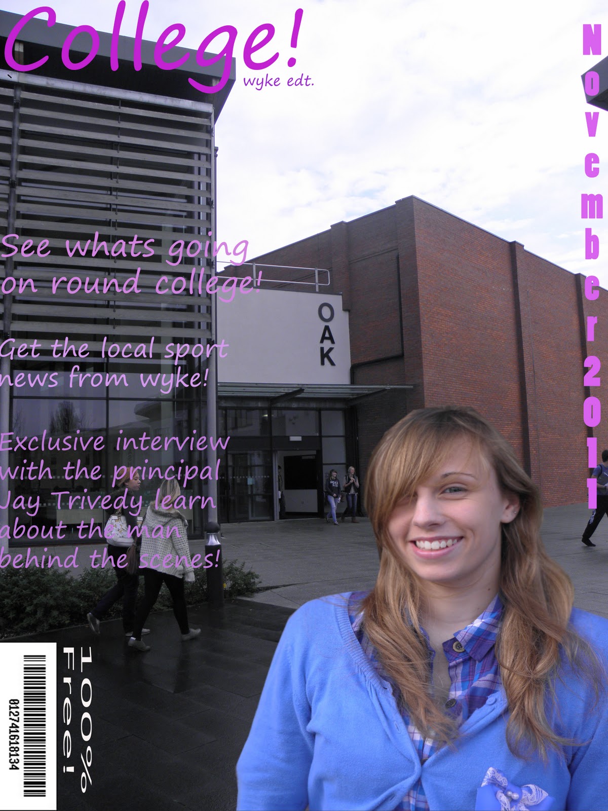
This college magazine features a Masthead which is located in the top left, as well as a college student who looks to be a popular student, due to her name being mentioned in one of the sub-headings, 'Nastia' the way she looks portrays her to be a hardworking student, with a love for the college she is at, this is shown by the i<3smu shirt she is wearing, the shirt's colour is also the same as the title, to show that this is linked to the college. The barcode is placed in the bottom right along with the price '100% FREE' this is more than likely to encourage college students to read the magazine and learn about events around the college. Also the background of the photo is blurred out to focus attention on Nastia, however the background is more than likely a picture of the campus which looks appealing to any prospective students who might pick up the magazine to help decide their college future. Also the sub-heading of 'He better hope they serve beer in hell' could relate to the fact that college students are seen to be at times, rebellious, unruly, drunken and bad people, especially if they have a different image to other people in the town/city they're local to, however because Nastia is in denim shorts and a t-shirt it would attract male attention. The magazines colour scheme features red, blue and black so it's not overly complicated and simple for people to understand however it does have a variety of different text styles, with bold making up the sub-headings and italics included for the title of a television show.

Thursday, 20 October 2011
Price of magazine
The price of my magazine would be £1.00 to college students and free to full time students and NUS card holders, this price is according to the fact that most students do not have a constant income and cannot afford something that is highly priced. The magazine itself will be published once every month to allow it to be filled with relevant information and to be worth the money that will it will cost.

Target Audience
The target audience that my magazine will concern is male and female college students, within the age range of 16-19 this is due to the majority of the college population being around these ages and split between the genders. The people that I'm trying to target are also inside the E demographic due to most of them being unemployed or part time workers they also fall under the value life style of outer directed due to them attending college which marks them as achievers.
Monday, 17 October 2011
Task 3 - Choice of College
GoAnimate.com: Media Studies - College choice by s0013515
Like it? Create your own at GoAnimate.com. It's free and fun!
During this animation I have indentified the college that will feature in my preliminary task for my magazine. I have actually chosen Wyke college as the feature, due to the accessability and high standards of cleanliness around the college, making it a picturesque location with a man/woman who would be a a willing participant.
Plus due to the timing restrictions I will have a much wider variety of shots available in the timescale available to me, in addition I am also a student at Wyke so know what's going on around the college.
Thursday, 6 October 2011
Terminology for Magazine Covers
Masthead - A magazines title which is usually in the top left corner.
Price - The price of the magazine.
Date - For weekly is usually from Saturday to Friday, for monthly is usually a month ahead.
Issue Number - The tally/count of magazines.
Barcode - Read by electronics and turned into usable info.
Teaser - A one word or phrase which acts as an attention grabber for the audience.
Main Feature: Headline - Something which tells the audience the main point of the magazine, usually large print and different colour and font to the other writing.
Subtitle - Smaller healine which can summarise the feature.
Smaller Feature - Feature's which make up the rest of the magazine apart from the main feature.
Images - Usually a Close Up or a Medium Close Up, usually ranges from one main image towards an 'x' amount which can feature one main and many smaller images. They're used to make the page more interesting and break it up. can also add understanding to a story and help lure the reader into reading the magazine.
Font - the style and size of wording/type face.
Colour - Specific/thematic/stylistic types of layout.
Graphics - Graphical shapes to highlight features of a page.
Offers/adverts Blurb - Banner style and shape of free products or promotions.
Monday, 3 October 2011
AS Media Preliminary Task
For my first task I need to, use a program which can edit and manipulate images to produce the front page of a new school or college magazine along with DTP (Desktop publishing), which must feature a student in a medium close up (waist and up) along with laid out text and a masthead. I must also create a mock-up of a contents page to show my grasp of DTP.
Subscribe to:
Comments (Atom)